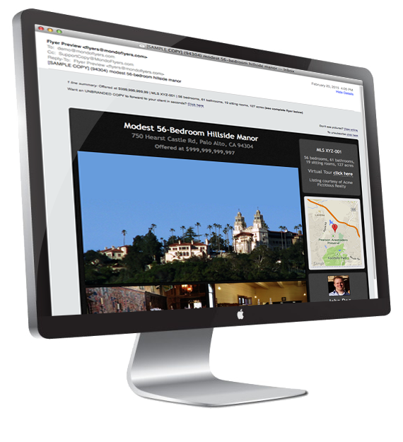
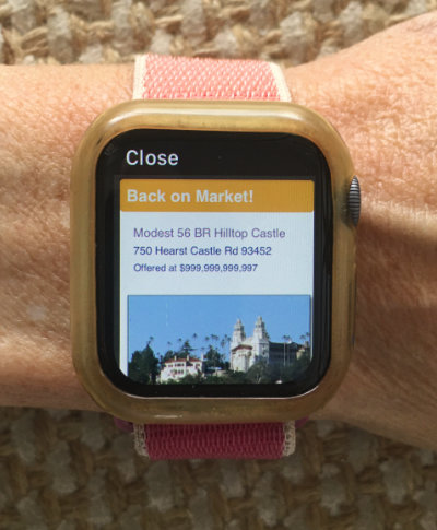
The world's only modern, mobile responsive real estate eflyers
Just like ALL the Fortune 500 brands, we send true mobile "responsive" marketing emails because they STAY readable on any screen size. Here's a quick 1-minute explainer video:
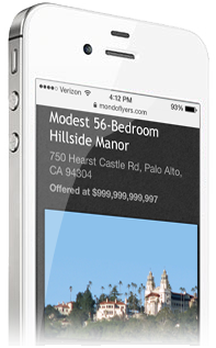
MondoFlyers' clean, classic, mobile responsive templates are always easy for busy agents to read on smartphones without cumbersome pinch/zoom/pan acrobatics, even when there is a lot of text.
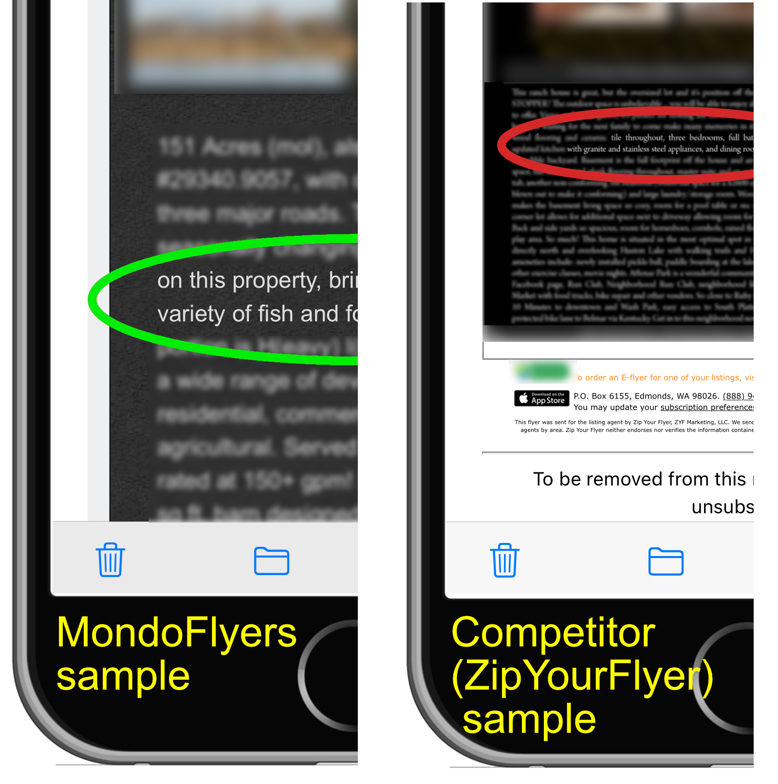
Meanwhile, cheaper agent-to-agent emailers still use decades-old shrink-to-fit templates:

MondoFlyers scroll (instead of shrinking everything). We keep your marketing text easy to read.
Text-size readability comparison: mobile view of a MondoFlyer eflyer (left) vs. an older & cheaper service ZipYourFlyer (right). Lower-left portion of March 2022 screenshots of two iPhone emails. You can view the ACTUAL SIZE 3000x3000 pixels image here. Each email screenshot is from the Apple Mail app on an iPhone 6S Plus, 1242×2208 pixels. We have intentionally blurred identifying listing details, showing only 15 non-identifying words (circled) for text-size readability comparison purposes. For easier reference, screenshots are superimposed on images of an iPhone.


